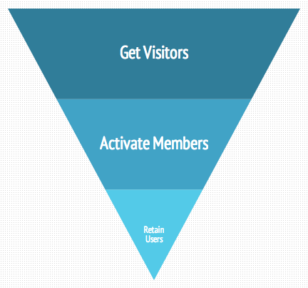
They’ve clicked the catchy headline, and now they’re on your site. While they nibble on your top-10 list and coy one-liners, they’re likely avoiding the reeling allure of another distracting headline. They’ve entered the funnel; now’s your chance to activate.
I know what you’re thinking. What funnel? Like the cake? Well…not quite.
Scroll back up. See the image of a what looks like a cooking funnel, the one you’d use to pour liquids from a wide-mouthed jar into one with a smaller opening? This is the growth-hacker funnel, funnel activation takes place in the middle of the funnel.
Alright. Before we discuss funnel activation, let’s skim over the whole funnel-growth-hacking process.
Growth Hacking
Growth hackers are different than marketers in that their primary focus is to grow their company. This obsessive drive leads to — you guessed it — growth-oriented tactics, or “hacks.”
Some have even gone so far as to call growth hacking “the new frontier of digital marketing”. What they mean to say is, this is an unharnessed, under-served niche with vast possibilities and huge promise.
The Growth Hacker’s Funnel
One of these tactics is the growth hacker funnel. Nope, this funnel isn’t used for cooking. It’s used to grab visitors, activate them as members and retain them as users. Why? Users become buyers; ideally, they become lifetime buyers. Lifetime buyers refer their friends who then enter the funnel and the process continues.
So this leads me back to the beginning. Once they’re visitors on your site, they’ve entered the top of the funnel. This is the time frame in which they’re either hooked on your snazzy articles or deciding whether to send their friends a Snapchat instead.
First-Time Visitors
These first-time visitors are strangers to your site. They know nothing about you yet. You haven’t given them a reason to care, and they have no relationship to you. They have no idea what’s in it for them. Your job at this stage is to hook their attention and engage their interest.
It helps to see it from the consumer’s point of view. While carousing the web, I’ve noticed many websites throw a pop-up on the screen asking me to subscribe to their email list or download their free e-book immediately after clicking the link. This is a great attention grabber, but I usually find it to be an annoyance. Why? They do this before I’ve even gotten to the content. For a first-time visitor clicking out of curiosity, it can be a turn-off to be asked to become a member before I’ve glimpsed the content. Why would I download an e-book on bioluminescence before I’ve read an article telling me what it is?
The idea is to first get them dancing on the edge of the funnel with engaging content. Try not to be too hasty with immediate pop-ups, but also don’t miss your chance to activate a membership. It’s a balancing act.
How to balance the balancing act? Once they know what’s up, make it intuitive and easy for them to sign up for the email list, create an account, or begin using the services then and there.
Activating a Member
Alright, so halfway through the article or in the margins of the page, they see a big button that says, “Subscribe to our newsletter!” Now that they’ve learned a little about bioluminescence, and you’ve sparked their curiosity about the amazing potential for futuristic technologies inspired and fueled by bioluminescence (that you’ve designed), they’re more likely to sign up and stay interested.
Now, they’re a part of what you’re doing; you have a relationship with them. You have direct contact with them and the ability to influence their future purchasing decisions.
The Holy Grail: Retaining Them as Users
Activating a member has two immediate goals: to build a relationship with the member and retain them as long-term users. Quick Sprout says it well, “If you create retained users, then you’ve reached the holy grail of growth hacking.”
The longer you keep them around, the stronger your relationship becomes, and the more likely they are to make a purchase. This is especially true for folks who need some time (and reminders) to think about and perhaps budget for the bioluminescent lamp they’ve wanted ever since signing up for your newsletter.
Revenue, Referrals and Repeat
Once you generate revenue, referrals follow and the whole process begins again! Really, though, the most crucial part of this process is the funnel activation. It’s the repetition that makes your message sticky and develops the trust needed for a loyal buyer-customer relationship. So we’re going to delve deeper into funnel activation.
And Now, Back to Funnel Activation
“Activation is: The first point where you deliver the value that you promised.” - KISSmetrics
Sean Johnson posted a slideshare on the topic The Ultimate Guide to Funnel Optimization in which slides 36-40 discuss funnel activation. A few pieces of advice picked up from the presentation:
- Test your headlines constantly; they’re critical. You can’t hook a fish without bait.
- In a straightforward manner, tell them the benefits of signing up.
- Keep your forms simple and only ask for information you need.
- Offering more for free gives them more value than offering them a discount.
- Live chat will help capture those who are faltering due to hesitations or questions.
- In every email, motivate them with a call to action.
- And in Johnson’s own words, “Send a series of email auto responders over 1 week teaching users how to get the most out of your service.”
So how exactly do you get them to make the shift from digesting media as a passive visitor to signing up for a newsletter to become an engaged user? The trick here lies in a conversion-centered design.
Read and Apply These Conversion-Centered Design Principles
Basically, what we’re doing here is persuading the visitor to complete a certain action through careful design and psychological triggers.
According to The 7 Principles of Conversion-Centered Design, landing pages use tactics like collecting personal data such as email, first name, and date of birth for your free birthday gift sample of bioluminescent, glow-in-the-dark material. They can also be used to provide education about your services. Landing pages are standalone pages that work “toward a single collective purpose — to usher your visitors toward the finish line,” HubSpot reports.
Though HubSpot lists seven, we’ll cover three of the principles for conversion centered design: contrast and color, directional cues and try before you buy.
- Contrast and Color
Your call to action should be easy to see and stand out from its surroundings. This is where contrast comes in handy. HubSpot advises, “If you have a very clean design without much detail or copy, a big black or white button can be dramatic.”
Color has a psychological effect in that it can trigger certain emotions or lead to subtle (but powerful!) identification with certain qualities a color is associated with.
- If you want to appear trustworthy and mature, try dark blue.
- If you want to come off as positive, comforting, and be associated with growth or organic products, try green.
- To appeal to those who are elegant and conservative, try gold.
- Directional Cues
Arrows and pathways are two examples of directional cues, whose purpose is unabashedly obvious and highly effective. Here, simply point arrows to where you want the visitor to focus. The visitor’s eye will be immediately pulled to your call to action. The same is true with pathways, whose purpose is a little more concealed to the visitor. They aren’t screaming “pay attention to this!” but they still pull the eye down the pathway.
→→→→→→→→→clickme
I bet your eyes followed those arrows, amiright?
- Try before you Buy
So they’re on your landing page but haven’t decided whether to close the tab or give you their email. This principle appeals to the people who simply need more incentive to sign up. For example, you could offer them the first episode free from your intriguing miniseries on bioluminescent technologies, or send them a free bioluminescent bracelet if they sign up NOW.
This might be the irresistible piece of bait needed to psychologically hook them. If they love it, and your target audience will, they’ll be back for more.
Important Points to Remember When Setting up Your Funnel Activation Landing Page:
- Time is your visitor’s most precious commodity. Don’t hog it.
- Keep it simple, jargon-free and personable.
- Keep the personal info you ask for to a minimum.
- Set up automated emails or other features to engage them after they sign up.
- Keep them engaged with further emails and alerts.
- Include a call to action in every email.
- Expose them to your products and services frequently, but not so frequently that you’re spamming them.
- Make your email content heavy and personable; talk to them like a friend.
Alright, this is where we leave off. Good luck with your funnel activation.


